Case Study
4WARD2GETHER
Celebrate Diversity. Empower Communities.
Overview
Context
4WARD2GETHER is a Scottish charity supporting community development, inclusion, and creative expression. I originally built their first website with a bespoke WordPress theme, but for the redesign I wanted to push further: creating a playful, modern identity that reflects their mission of bringing people together. The existing site worked functionally but felt restrictive in terms of design. The charity wanted something more colourful, engaging, and representative of their values. I saw an opportunity to introduce bold visuals, vibrant gradients, and interactive elements while keeping usability and accessibility central.
Goal
Redesign the website to be modern, inclusive, and engaging, while improving storytelling and usability.
My Role
Designer & Developer. I led the project end-to-end: brand direction, design, and technical build.
Objectives
Strategy
- Redesign the website to be more modern, inclusive, and engaging.
- Improve storytelling about the charity’s mission, team, and impact.
- Integrate their Instagram feed so the team can easily update news and events.
Target Audience
- Local communities in Ayrshire.
- Volunteers, supporters, and partner organisations.
- Wider audiences interested in the charity’s mission.
Requirements
- Colourful yet professional aesthetic.
- Mobile-first responsive design.
- Accessibility compliance.
Brand Direction
Logo
I recreated the 4WARD2GETHER logo in Affinity Designer, refining the form for consistency across digital use.
Colour Palette
Primary
Pink#FF0076
Blue#0C13B1
Teal#22797A
Purple#9E19E2
Secondary
White#F2F2F2
Black#2E2E2E
Typography
Logo
Baloo 2
Headings
Inter
Body
Baloo 2
Inspiration
- Neo-brutalist design & Swiss graphic design (bold type, geometric layouts).
- Cartoon-like playfulness with gradients and shapes for inclusivity.
Design Process
Wireframes
Created wireframes exploring asymmetric grids and bold hero sections.
Hierarchy & Layout
Focused on strong headlines, clear CTA buttons, and visual separation of sections, balancing bold typography with white space.
Design Decisions
- Animated gradient backgrounds to convey 'forward movement.'
- Use of geometric shapes and colourful section dividers to add energy.
- Brutalist touches in layout (asymmetry, bold headings) balanced with soft typography.
Accessibility
- Ensured layouts scaled smoothly across devices with touch-friendly navigation.
- Maintained contrast and readability despite colourful palette.
Development Process
Tech Stack
- Next.js (Pages Router)
- Tailwind CSS
- Elfsight (Instagram integration)
Features Built
- Animated multi-colour gradient backgrounds for hero.
- Responsive design for all screen sizes.
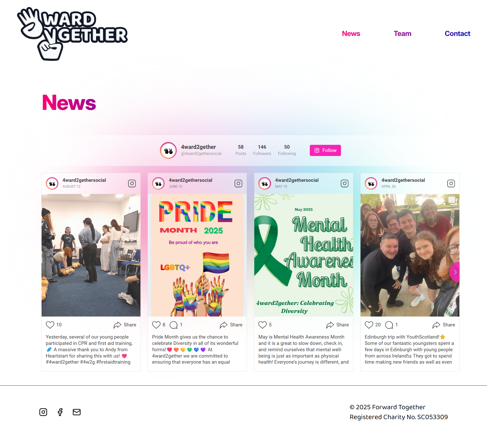
- Instagram feed integration to keep news and events dynamic.
Challenges Solved
- Balancing performance with animations by keeping gradient animation lightweight with CSS rather than JS.
Final Outcome
Description
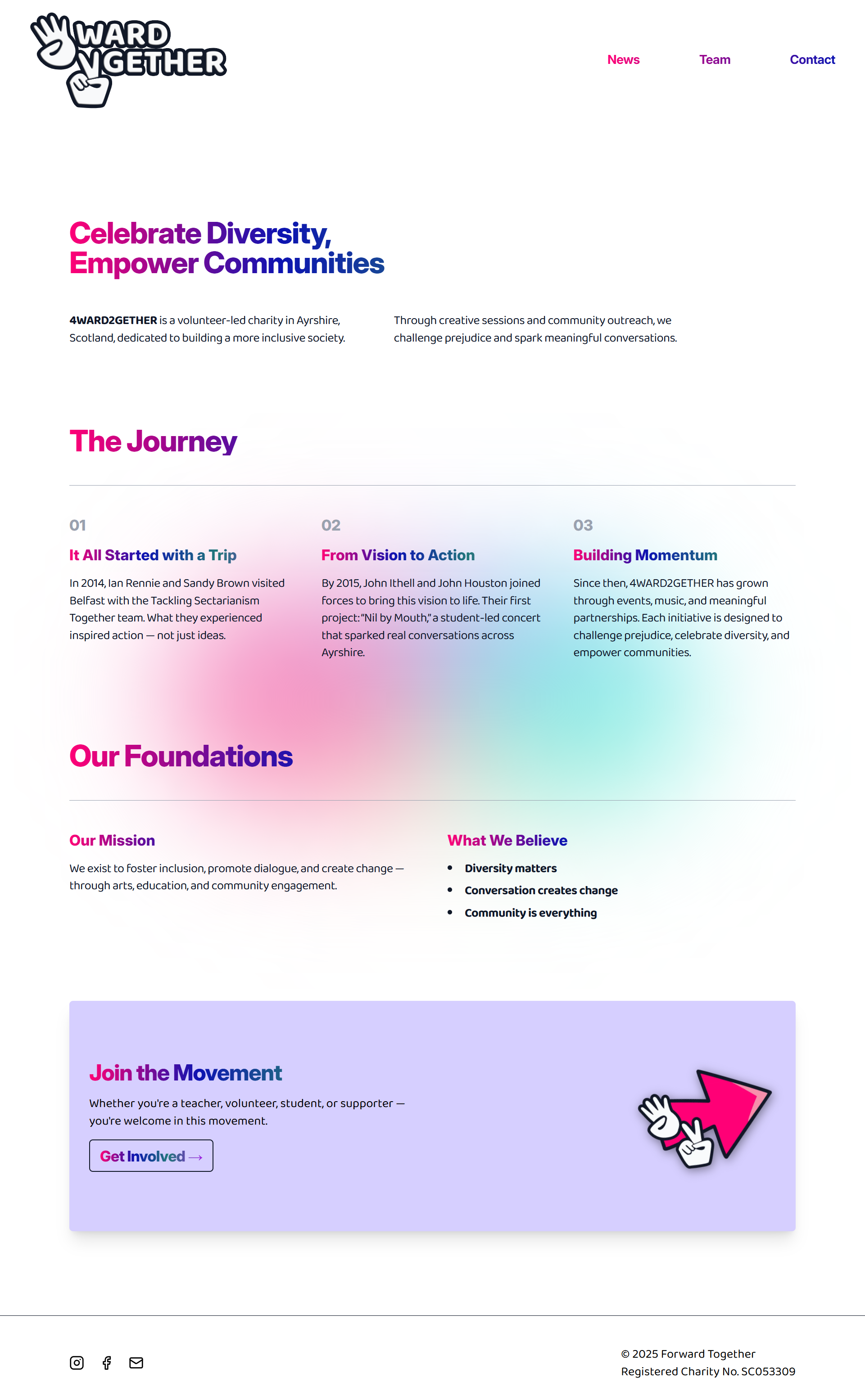
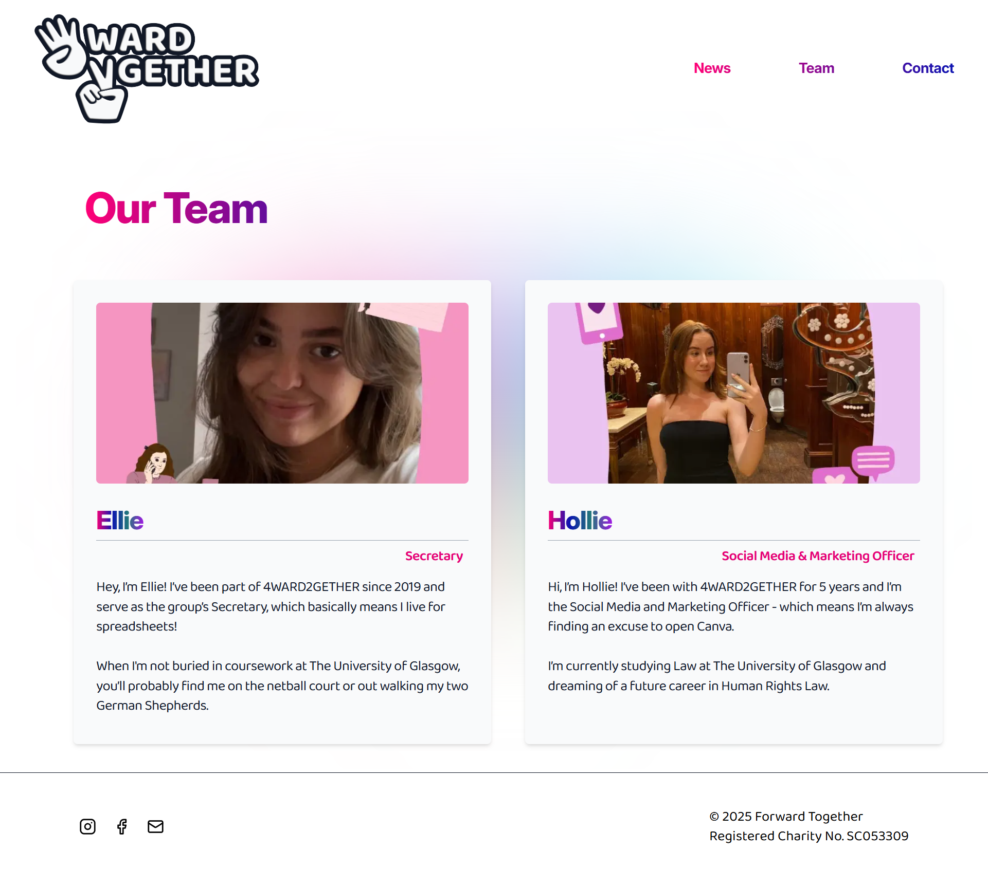
The new 4WARD2GETHER site feels colourful, modern, and welcoming. At the forefront, the hero section combines an animated gradient with bold typography to create an immediate sense of energy and impact. This is followed by a structured, grid-based About section that introduces the mission and team with clarity and balance. The News & Events area brings in Instagram integration to keep the site dynamic and connected to the community, while the Contact page rounds off the experience with a clean form and playful dividers that make reaching out simple and inviting.
Live Site
Screenshots
Reflection
What I Learned
Learned how to bring playful, colourful branding into a clean, modern framework, while balancing creative expression with accessibility.
What I’d Improve
Explore deeper animations (micro-interactions, transitions).Add richer media (video, community stories).Potentially explore multilingual support.
Value
This project taught me how to merge bold visual design with a flexible CMS for a real-world organisation. For the client, it created a more vibrant online presence that reflects their mission and provides tools for easier communication with their community.