Case Study
Atlas
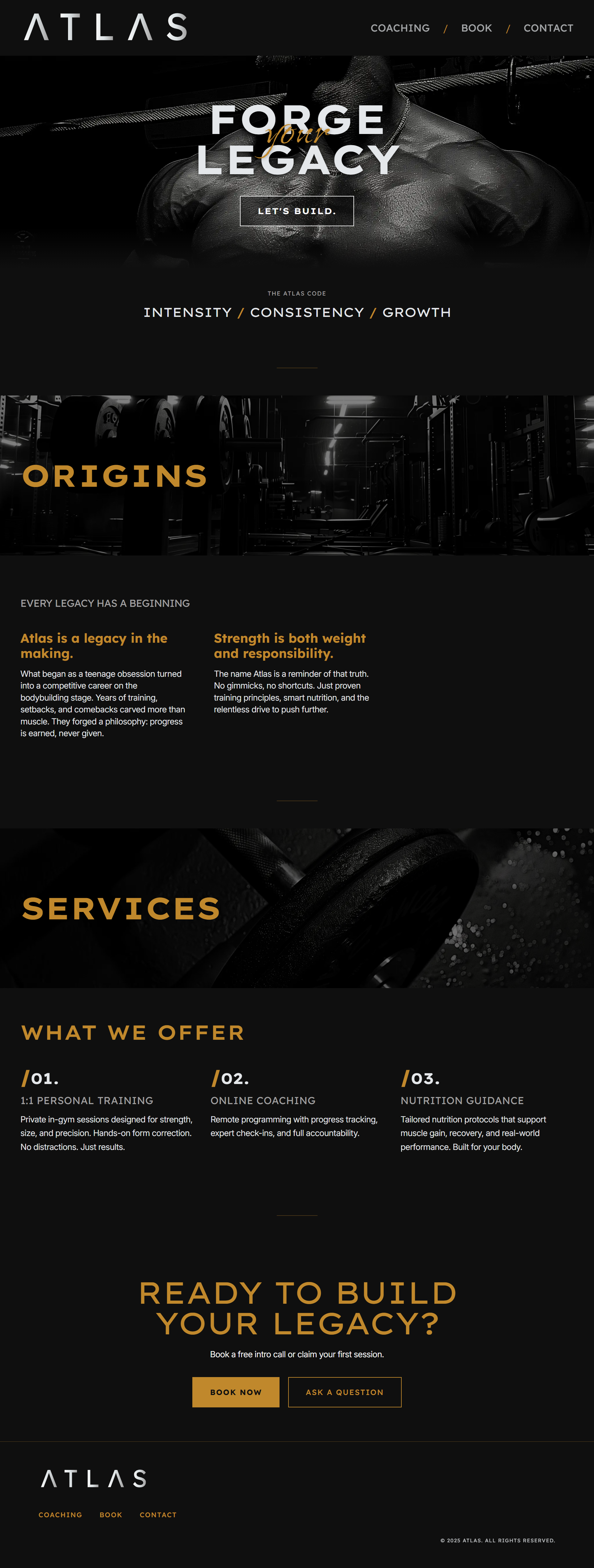
Forge Your Legacy
Overview
Context
Atlas is a website for a ex-competitive bodybuilder specialising in muscle growth. The goal was to design a bold, editorial-inspired platform that communicates authority, discipline, and intensity which reflects both the trainer’s persona and the target audience’s ambitions.
Goal
To create a digital presence that balances hardcore, mythical energy with modern usability and accessibility.
My Role
Designer & Developer. Full creative direction, branding, design, and build.
Objectives
Strategy
- Design and develop a site that feels powerful and motivating while remaining clean and functional.
Target Audience
- Primarily male bodybuilders and fitness enthusiasts aiming to build muscle.
Requirements
- A bold visual identity with a Swiss-inspired design system
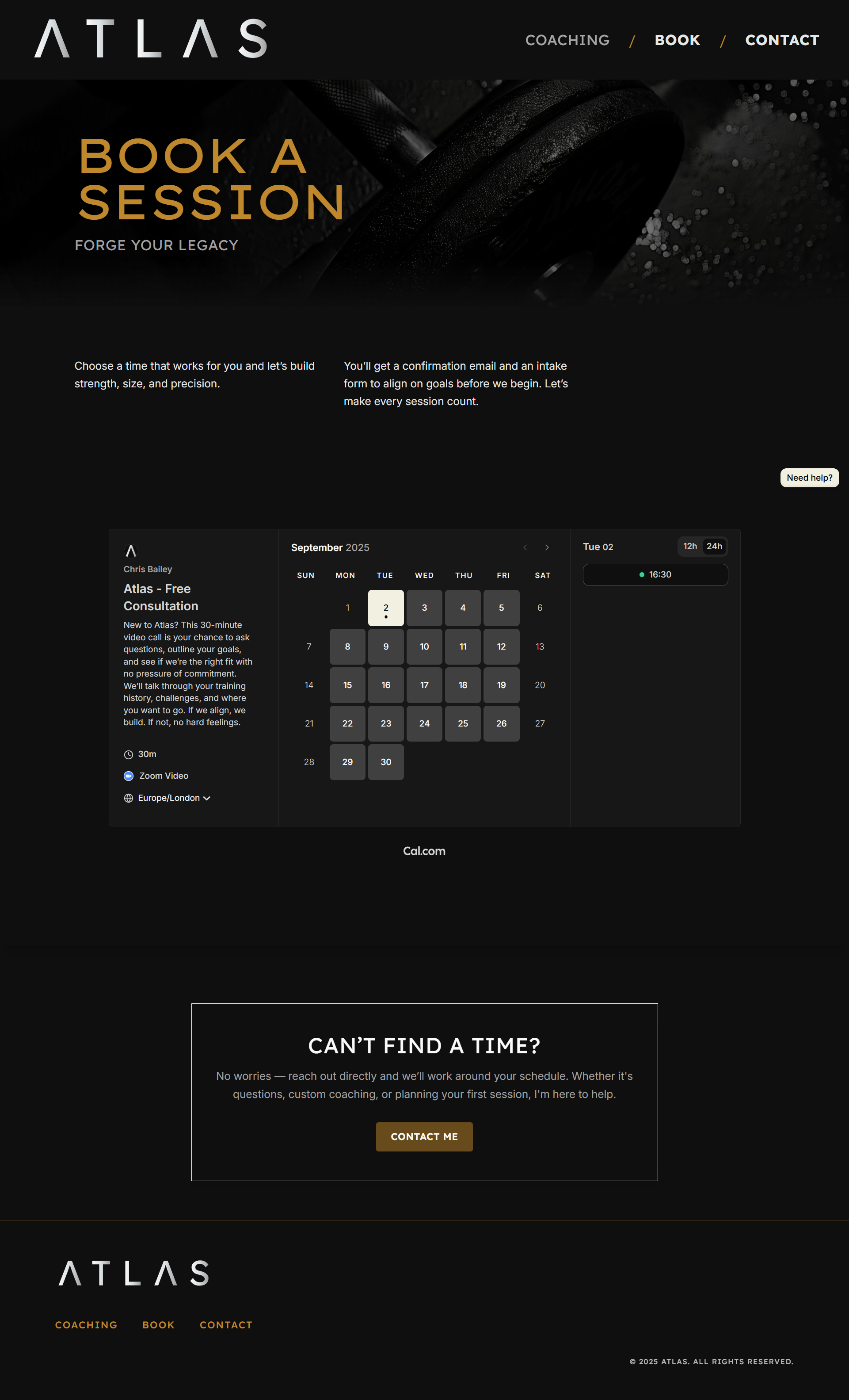
- Integration with Cal.com for booking training sessions
- Mobile-first responsiveness for users browsing on the go
- Straightforward navigation with a clear call to action
Brand Direction
Logo
A minimal wordmark paired with strong geometric type. A silver gradient was chosen over gold for the logo to create contrast on the dark background, while gold was reserved as the accent colour.
Colour Palette
Primary
White#FAFAFA
Black#0F0F0F
Gold#C0882C
Secondary
Light Gray#E4E7EA
Mid-Gray#A1A0A0
Dark Gray#2C2C2C
Typography
Logo
Lexend Giga
Headings
Lexend deca
Body
Inter
Cursive
Island Moments
Inspiration
- Swiss graphic design
- Editorial magazine layouts
- Asymmetric grids
- The visual language of strength culture
Design Process
Wireframes
Began with a modular grid system to emphasize hierarchy and rhythm. Key sections (hero, coaching, origins, booking) were planned with deliberate balance of text and negative space.
Hierarchy & Layout
Used oversized typography to dominate the hero section and clear section dividers to control pacing.
Design Decisions
- Minimal colour use to let typography and imagery carry weight.
- Asymmetry in layouts to create tension and visual interest.
Accessibility
- High-contrast palette for readability.
- Responsive scaling for fluid typography across devices.
Development Process
Tech Stack
- Next.js (App Router)
- Tailwind CSS
- Cal.com
Features Built
- Custom booking flow with styled front-end form feeding into Cal.com
- Section dividers and editorial-inspired grid layouts
Challenges Solved
- Balancing design freedom with Cal.com backend by building a custom front-end wrapper.
- Maintaining responsiveness with large typography while preserving accessibility.
Final Outcome
Description
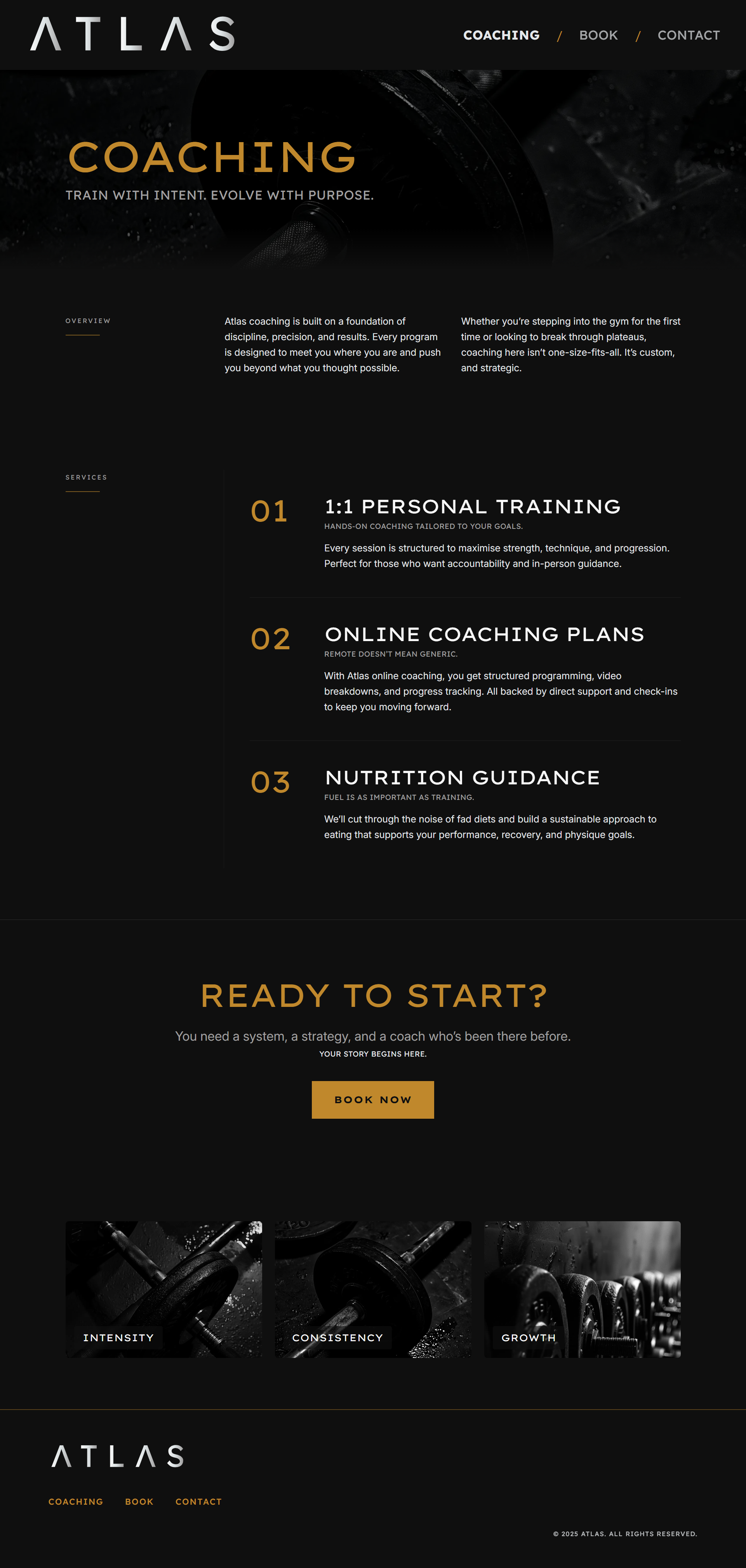
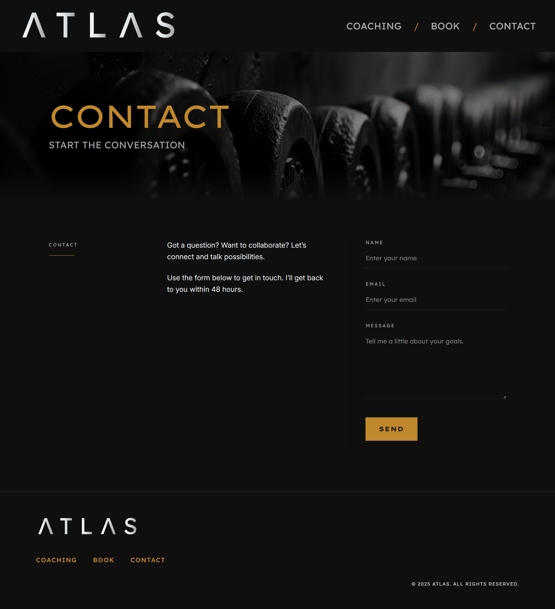
The final outcome for Atlas is a site that is bold, and visually striking. The hero section establishes an immediate presence with oversized typography and a commanding brand statement, setting the tone for the entire experience. The coaching page presents services in an editorial style, pairing clarity with impact, while the origins section tells the brand story with mythical undertones that reinforce the philosophy behind the name. A streamlined contact and call-to-action section ensures booking is simple and direct. Built with a mobile-first approach, the design scales across devices, maintaining its sharp, disciplined aesthetic from desktop to phone.
Live Site
Screenshots
Reflection
What I Learned
Atlas is a project that fuses bold Swiss-inspired design with practical web development. I learned how to push typography and minimalism to create emotional impact while keeping the user experience clear and actionable.
What I’d Improve
If I were to iterate further, I’d expand with a blog for training tips and integrate an e-commerce section for selling digital programs or merchandise.
Value
This project was valuable because it demonstrated how a strong brand vision, paired with modern development tools, can turn a conceptual client into a fully realised digital identity.